Modernism 2026
Below is the speech that I gave as part of Palm Springs Modernism 2026 at the Hyatt Palm Springs Sunday Feb. 15, 9 a.m., yes 9 a.m.
Modernism 2026
Good morning, and welcome to Discovering the Modern Modernist — our little tour through the Palm Springs artists we know and love, and the mid‑century modernists who helped shape them.
You can find every one of these artists in one of our five art districts — Via Negocio, SOTA, the Lofts, Backstreet, and the Perez Art District — and yes, they’ll all be open this Saturday from noon to six. Consider this your late‑night infomercial, the one you stumble onto at three in the morning… except this one actually gets better the longer you watch.
We’re going to move through these artists by the decade of their influencers. Mid‑century technically runs from 1930 to 1970 — which of course means we’re starting before that, with the people who influenced the people who influenced the people we’re talking about today
So we first land in pre‑WWI France — a moment when life was good, the country was relaxed, and the art followed suit. And to show how these lineages travel across generations and land right here in our own backyard, I want to begin with someone who’s influencers were influenced: Craig Mann.
Craig Mann’s current work pulls from the still lifes of Southeast Asian modernists Nena Saguil — the Filipina painter who studied in Spain and France in the 1950s and blended Cubist geometry with her own local visual language. Saguil herself was looking back to Picasso and Braque, the original Cubist troublemakers whose fractured planes and sharp geometry shaped the early part of the century. These ideas didn’t stay put; they traveled across continents and decades, eventually landing in all kinds of unexpected places — including Palm Springs.
Craig picks up Cubism and brings it into the present, creating Cubist still lifes with his own mix of clarity, color, and cultural curiosity. And if you know Craig, then you know when he falls in love with a subject, he commits. Fully. Last year it was Mid‑Mod architecture, before that it was drag queens, and now he’s deep into Southeast Asian still life. He’s basically a one‑man art‑historical road trip, and honestly, he’s the perfect place to start when we talk about being influenced.
David Farnsworth pulls from a whole mix of mid‑century influences — the playful modernism of Italian ceramicists Guido and Bruno Gambone, the symbolic poetry of Paul Klee, the bold mask‑like forms of Picasso, and even the architectural ceramics of the 1960s. All of that comes together in pieces that feel both ancient and modern at the same time. They’re part folk object, part architectural fragment, part whimsical little character.
David takes that mid‑century love of global forms, pattern, and honest materials and brings it forward in his own way. His work has this grounded, tactile presence, but there’s always a spark of humor hiding in there too — which, if you know David, makes perfect sense.
Kevin Goddess works out of the world of mid‑century geometric abstraction, drawing from artists like Paul Klee with his intuitive geometry, Carlos Mérida with his rhythmic blend of culture and modernism, and Le Corbusier with his clean architectural structure. Kevin’s paintings balance geometry with something softer — shapes that feel both structured and organic, like they’re breathing a little.
He works through improvisation, letting the shapes talk to each other until they settle into place. The result is a visual language that feels solid and weightless at the same time. He takes that mid‑century belief that geometry can carry emotion and pushes it into something very much his own.
But the softness of the 1920s doesn’t last. The Great Depression hits, optimism collapses, and the world starts its slow march toward another war. And as life gets harder, so does the art — curves sharpen into angles, ornament gives way to geometry, and modernism trades playfulness for purpose. This is the era of the Bauhaus and Constructivism, when art becomes disciplined and intentional, a response to a world that suddenly needs structure more than decoration.
Reese Schroeder works right out of that moment — the Bauhaus love of clarity, the Constructivist devotion to structure, the belief that geometry can hold things together when the world can’t. Except Reese brings all of that into the digital age. His work has the precision of László Moholy‑Nagy and the engineered logic of early modernist design, but with luminous gradients, pixel‑clean edges, and a sense of motion that belongs entirely to now. It’s the hard‑edge modernism of the 1930s, translated into digital form. The grid didn’t disappear — it just moved onto the screen.
And here’s a funny moment from writing this talk. I asked all the artists to send me three images and three sentences about who influenced them. Then I fed just the images into my AI and asked what it saw. It immediately said, ‘Oh, this one’s an architect.’ Just from the art. I told Reese, and he said, ‘Dammit. I was trying to leave that world behind.’
T. Santora’s work sits at the crossroads of three major mid‑century voices. From Josef Albers, he gets that disciplined geometry and color logic. From Mark Rothko, he picks up the atmospheric depth that turns simple shapes into quiet, emotional spaces. And from Richard Diebenkorn, he draws that West Coast balance of structure and intuition — geometry that feels architectural but still human. The result is contemporary abstraction that brings mid‑century modernism right into the Palm Springs present with clarity and warmth.
Scott Bendrick’s ceramics come out of that early modernist moment when clay stopped being seen as “craft” and started being treated as sculpture. His influences include the organic modernism of Isamu Noguchi and the expressive clay traditions that emerged between the wars. But to really understand Scott’s work, you have to look at the Gambone brothers — Guido and Bruno — the Italian modernists who brought bold pattern, graphic abstraction, and sculptural form into mid‑century ceramics.
The Gambones blended folk tradition with modernist experimentation, creating pieces that felt both ancient and avant‑garde. Scott carries that forward. You can see it in his surfaces — the crackle glazes, the bold stripes, the painterly marks — and in his forms, which balance restraint with expressive energy. His pieces feel architectural yet handmade, refined yet primal
But the 1930s can only hold their discipline for so long. As the world descends into World War II, modernism breaks open. Europe is devastated, Paris is in ruins, and the horrors of the Holocaust and the atomic bombs reshape the human psyche. The center of the art world shifts from Paris to New York, where artists stop chasing perfect geometry and start searching for something big enough to hold grief, resilience, and the complexity of being alive
And that brings us to Anne Bedrick.
Anne’s work sits between Helen Frankenthaler’s early stain paintings — where the body dissolves into color and gravity — and Germaine Richier’s postwar sculpture, where the human figure is shaped and worn down by the world around it. In both her paintings and her cement sculptures, Anne treats the body as something provisional and deeply felt. Her work understands the body the way post‑war artists did: resilient, vulnerable, and shaped by its environment. She brings that forward into a contemporary, feminist voice that stays true to the emotional core of mid‑century modernism.
And if you’ve been following Anne’s work, you’ve probably noticed the shift. The pieces have gotten deeper, more introspective. What used to be pure abstraction has started to include figures — quiet observers, thinkers — as if the paintings themselves have begun watching the world back.
While New York is building Abstract Expressionism, other modernisms are evolving across the globe.
Alberto García‑Uria’s work is rooted in the Cuban Vanguardia movement — a blend of European abstraction and Afro‑Cuban modernism with deep West African roots. He draws from Wifredo Lam’s mask‑like ritualistic figures, and from Amelia Peláez’s bold outlines. Those influences mix with the post‑war humanism of Giacometti and Francis Bacon, artists who wrestled with the fragility and endurance of the human form after global trauma.
The result is a figure that feels luminous, elongated, and culturally charged. Alberto carries the emotional weight of a century marked by rupture and resilience into the present, honoring identity, ancestry, and survival.
Meanwhile, back in America, the mood is different. While Europe is reckoning with ruins, American artists turn inward — toward quiet rooms, late‑night diners, empty streets, and the psychological weight of ordinary life. This is the world of Edward Hopper, where human presence shows up through light and architecture more than bodies. And this is where we find Kathleen Strukoff.
Kathleen draws from that same cinematic stillness — the glowing phone booths, the lone cars, the quiet interiors where a whole story hangs in the air. But she brings it forward. Her brushwork has the softness of post‑war introspection, her color fields nod to the Bay Area Figurative painters, and her compositions feel like film stills. She captures the emotional landscape of the 1940s not through people, but through the spaces they’ve just stepped out of.
A collector once told her, “If Edward Hopper and David Hockney had a baby, it would be you.” And honestly, it fits — the quiet, cinematic solitude meets the luminous California color. Her paintings feel timeless and unmistakably modern.
Julianna Poldi brings us back into pure abstraction — but with a softness and spiritual depth that could only come out of the post‑war 1940s.
Julianna works in that world of post‑war abstraction, drawing from Franz Kline’s bold structural strokes, Jackson Pollock’s physical movement, and Elaine de Kooning’s lyrical, embodied gesture. Her paintings carry the emotional heat of the era, when artists were trying to make sense of a world that had changed forever.
But she brings a gentler, more luminous touch. Her paintings feel like meditations — layered, glowing, and quietly intense. She treats color as presence, surface as memory, and abstraction as a way to reach the things language can’t quite hold.
And then the world shifts again. The war is over, Europe is rebuilding, and for the first time, America steps onto the world stage as a cultural leader. What had been a
country of cowboys, farmers, and railroad tycoons suddenly becomes a nation building schools, highways, airports, and a booming middle class. High tax rates on the wealthy fund public education, the GI Bill, and coast‑to‑coast infrastructure.
Cities grow, optimism returns, and a new architectural language takes shape: clean lines, open plans, glass walls, and of course — breeze blocks. This is the world that gives rise to mid‑century modernism. And it’s exactly where Erich Meager’s work lives.
Erich’s pieces are quintessentially 1950s — crisp, architectural, and rooted in the geometric clarity of the post‑war American West. His laser‑cut paper works echo the breeze blocks, shadow patterns, and modular rhythms of Palm Springs architecture, translating mid‑century design into contemporary craft. He carries the optimism and precision of the era into something tactile and newly alive.
Continuing with Minimalism, we come to David A. Clark and his arrows — works that distill mid‑century modernism down to its most essential unit: direction. His arrows operate like modular architecture, echoing the serial logic of Sol LeWitt, the clarity of Donald Judd, and the disciplined geometry of the Bauhaus. They’re not symbols; they’re objects. Repeated forms. Sculptural decisions. Each arrow becomes a building block, a unit of rhythm, a piece of visual infrastructure.
In Clark’s hands, the arrow becomes a modernist device — a way to explore motion, orientation, and the clean, optimistic geometry that defined the 1950s. It’s a reminder that simplicity isn’t emptiness; it’s intelligence.
We move into the luminous world of Don Dietz, who channels that same modernist clarity through color, light, and architectural form. Dietz draws from the Bauhaus, and mid‑century architectural glass, using primary color, black line, and modular geometry to create pieces that feel like miniature modernist facades. His fused‑glass works carry the optimism and order of the era — crisp, iconic, unmistakably mid‑century.
And from Dietz’s glowing glass — where geometry becomes light — we arrive at Lisa Van Herik, who brings that same modernist clarity into fiber, metal, and woven structure.
Lisa works in mid‑century textile modernism, drawing from Anni Albers’ Bauhaus geometry, Ruth Asawa’s sculptural wire forms, and Sheila Hicks’ material intelligence. Her practice merging the logic of weaving and basketry with geometric abstraction. She turns line, pattern, and structure into contemporary works that feel both architectural and tactile — echoing the warmth, clarity, and craft‑driven innovation that defined mid‑century design.
Deanna Fainelli bridges mid‑century figurative modernism with contemporary abstraction. You can feel de Kooning’s gesture, Bay Area light, and a touch of Pop clarity in her work — figures dissolving into bold outlines and color fields, turning everyday scenes into emotional landscapes. Inspired by travel and memory, she transforms overlooked textures into layered compositions that move fluidly between abstraction and figuration. Largely self‑taught, she channels Diebenkorn’s expressive color and sense of space, bringing modernism forward into a personal language of gesture and narrative.
And then we head into the abstract suburbs with Lynda Keeler — an artist who translates the post‑war American landscape into interlocking zones of color, rhythm, and memory. Her work sits in mid‑century West Coast abstraction, where artists like Richard Diebenkorn, Helen Lundeberg, and Karl Benjamin turned the growing suburbs, aerial grids, and new developments of the 1950s into geometric poetry.
Lynda doesn’t paint houses — she paints the feeling of them. Her compositions map the emotional geometry of the suburbs: the order, the promise, the quiet strangeness of planned space. In her hands, the 1950s suburban expansion becomes a modernist language of its own — blending mapping, movement, and lived experience into color and form.
And so the 1950s were a great time — if you were straight and white. But by the 1960s, everyone else wanted a piece of the American promise, and rightfully so. The decade becomes a pressure cooker of civil rights, feminism, queer liberation, anti‑war movements, and a generation refusing to inherit their parents’ rules. If the 1950s were about order, the 1960s are about breaking it. Even in art.
The world outside the gallery starts to fracture — cities erupt, voices rise, and the modernist grid begins to crack under the weight of protest and cultural upheaval. Andrée Carter brings us right into that moment. Her mixed‑media works fuse Rauschenberg’s urban collage, Romare Bearden’s cultural layering, and the urgency of 1960s protest art. Buildings splinter, threads pull, colors drip. Her work shows us a country in motion — a decade where structure gives way to struggle, and struggle gives way to transformation.
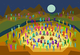
And after all that rupture — the marches, the uprisings, the cities shaking themselves awake (sound familiar) — you have to ask: how does anyone keep their sanity in a decade like this. Well, in a word… drugs. When the world outside was burning, the world inside became the next frontier. Consciousness cracked open, color exploded, and suddenly art wasn’t just about what you saw — it was about what you felt, heard, or hallucinated.
Brings us to Delphine Bordas, ushering us into the psychedelic 60s with work that doesn’t depict reality — it dissolves it. She may begin with the macro‑botanical logic of Georgia O’Keeffe, but the experience belongs entirely to the 60s. Her saturated, glowing color fields echo psychedelic posters, Op Art vibration, and the expanded‑consciousness palette of the era.
She extends mid‑century modernism into a psychedelic state of perception — one where the real and the surreal trade places, and the botanical becomes cosmic.
Our next rule‑breaker is Lisa Loudin and her pen‑and‑ink trips — drawings that feel completely 1960s without ever touching psychedelic color. She merges scientific illustration, surrealism, and counterculture perception. Her trees become portals, her patterns pulse like altered states, and her hidden imagery turns the natural world into a map of consciousness. She’s not drawing what a tree looks like; she’s drawing what a tree knows.
Her work carries the spirit of the 1960s — expanding awareness, questioning authority, dissolving the boundary between the visible and the invisible. In her hands, pen and ink become a psychedelic instrument — a way to explore perception, consciousness, and the mythic interior life of nature.
And as we keep expanding what art can be, we come to Henriette Heiny — an artist who doesn’t just break rules, she dissolves them. If the 1960s taught us to challenge authority and push beyond the visible world, Heiny takes that spirit straight into the material itself. She works in Abstract Expressionism and Color Field painting, drawing from Helen Frankenthaler and Morris Louis, but pushes both into new territory.
Her paintings embrace flow, gravity, and the autonomy of paint, letting color form cellular, geological, and aquatic structures that echo natural processes. Heiny treats painting as a collaboration with the paint. She turns fluid media into living topographies of movement and depth, expanding what a painting is allowed to do.
And then we hit the 1970s — the decade where the floor drops out from under the American dream. Historians can trace how certain fears and frustrations got used to build new voting coalitions. Unspoken political pacts were made so that this civil rights nonsense would dwindle in exchange for lower taxes on the rich and suddenly the middle class that powered mid‑century modernism starts to wobble and for the first time since the Great Depression, prosperity stops being shared.
And the art world feels that shift as well. Artists stop believing in one big idea, one big style, one big truth. Pop Art is about to take its final bow — as the last great “ism” after that, everything splinters. Conceptual Art says that idea matters more than the object. There is Feminist Art, Performance Art, even Land Art.
It’s not chaos — it’s a new reality. The center doesn’t hold, and artists stop pretending it should. The 1970s become a decade of critique, irony, spectacle, and reinvention. And that’s exactly where our next artists step in.
Ernesto Ramirez works in mid‑century Pop Art, drawing from Andy Warhol’s celebrity iconography, Roy Lichtenstein’s graphic stylization, and the vibrant theatricality of Mexican pop culture. His portraits blend retro Americana, psychedelic color, and pop‑surrealist humor, transforming familiar faces and symbols into bold contemporary icons. He expands Pop by infusing it with cultural hybridity, wit, and a modern sense of play.
Where Warhol gave us Marilyn and soup cans, Ramirez gives us luchadores and glam‑rock saints. He pushes Pop beyond the white American canon, showing us a more honest and colorful version of the culture we actually live in.
And then we get to Big Mike Arnone — the artist who takes mid‑century modernism, plugs it into a power outlet, and blows the doors off the building. His work begins with the clarity and optimism of the 1950s: the architectural rigor of Richard Neutra, the swooping futurism of John Lautner, the sculptural purity of Brâncuși. But he doesn’t leave it there. He accelerates it.
Arnone merges those influences with the kinetic punch of Italian Futurism — especially Giacomo Balla’s belief that motion is an emotional. The result isn’t just abstraction. It’s architecture in motion. Geometry with a pulse. Modernism after a double espresso.
And then that leads us to this guy — Terry Hastings — who creates images of hot guys naked by the pool. So obviously his big influence is David Hockney. Groundbreaking.
But wait… aren’t those guys wearing swimsuits.
What’s going on, Terry.
Well… if you must know, I’ve been reading the writing on the wall for a few years now. Remember what happened in the 70’s, cutting taxes for the rich and stifling civil rights, well, those chickens are roosting and are the size of vultures. We’ve gotten ourselves into a deep conservative rut. Project 2025 is slowly happening, including the banning of anything deemed “pornographic.” I’m not saying what I do is pornographic — but let’s be honest, I’m closer to that line than most artists. Etsy already banned the sale of nude images and shut down my shop. eBay gives me a daily battle, including banning photos of feet. Feet.
So about five years ago, I started developing my cut‑out series. A transition from “photography” — bad — to “art” — good. At first, my graphic figures were nude, frolicking in drum circles, living their best queer utopian lives. But slowly, when we got back to the pool, they put shorts on. I know. And then I became even more conservative and removed humans altogether. And replaced them with trees. Singular sentinels in the wilderness. Waiting. Watching. Holding the line until this “decade” ends — which it will — and the celebration that inevitably follows when the pendulum swings back. Because history moves in cycles, like clockwork.
So as we’ve seen, every modern artist of today has been influenced by modernist artists of the past — and is, in turn, influencing the modernists of the future. That’s the through‑line of everything we’ve looked at. When you study the past, you can see the future. Not through rose‑colored glasses or crystal balls, but through honest, historically grounded understanding.
Because art, like history, is a continuum — a relay and a replay of ideas, a conversation across decades. Each generation shapes the next, knowingly or not. And that is the real legacy of Modernism: not a style, not a period, but a line of artists learning from history, responding to their moment, and leaving something behind for whoever comes next.
Thank you all so much for being here this morning. If you have any questions, come on up and talk to me after the speech. It’s been a joy walking through this history with you. Now go make your plans to visit our incredible artists. Including me at the 3 Seasons Gallery on Perez Building I Suite 16. About the only perk of giving these speeches is being able to plug myself. My fellow artists and I will have our studios and galleries open this Saturday noon to 6, and we can’t wait to share our work with you. And tell them, Terry sent you.
—


Craig Mann


David Farnsworth


Kevin Goddess


Reese Schroeder


T Santora


Scott Bedrick


Anne Bedrick


Alberto Garcia Uria


Kathleen Strukoff


Julianna Poldi


Erich Meager


David A Clark


Don Dietz


Lisa Van Herik


Deanna Fainelli
Lynda Keeler


Andree Carter


Delphine Bordas


Lisa Loudin


Henriette Heiny


Ernesto Ramirez


Big Mike Arnone


Terry Hastings